初识 QSS
简介
CSS( Cascading Style Sheets,层叠样式表)把现在的网页打扮的或花枝招展、或简约朴素。使用 CSS 将结构和表现分离的设计理念启发了 Qt 的样式设计,于是出现了 QSS( Qt Style Sheets ),给界面的开发增添了极大的灵活性。这就好比界面部件( Widget )结构化了人的衣着(帽子、上衣、裙子、鞋子),QSS 则定义了这些衣服的颜色、花纹等样式,每天只需关注换什么样式即可,不用去想要不要穿裙子(当然,你非要穿裤子也是没问题的)。
语法结构
在语法上 QSS 与 CSS 大体上是一致的,由两个主要的部分构成:选择器( selector ),以及一条或多条声明( declaration )。
selector {
  declaration1;
  declaration2;
  ...
  declarationN
}
选择器
选择器是我们的 widget,比如 QPushButton、QLineEdit 等,可以使用星号 * 来匹配所有的选择器。当界面上有多个 QLineEdit ,而我们却只想改变特定 QLineEdit 的样式时可以使用 QObject::setObjectName() 给那个 QLineEdit 命个名字,然后使用 ID 选择器来设置样式表。
QLineEdit#nameEdit { background-color: yellow }
当然了,我们也可以直接修改一个部件的样式表,像这样:
nameEdit->setStyleSheet("color: blue;"
                        "background-color: yellow;"
                        "selection-color: yellow;"
                        "selection-background-color: blue;");
从上边的例子不难看出声明( declaration )的结构应该是这样的:
property: value
property 是要设置的样式属性名,value 则是它的值。比如 border、background、margin、padding 等都是属性名。属性和值之间用冒号隔开,两条声明间用分号隔开。声明中的大小写是不敏感的。
盒子模型( The Box Model )
怎么理解 padding、border、margin 这些属性呢?
当使用样式表的时候,每个部件( widget )都被当作一个由四个同心矩形组成的盒子来对待。这四个矩形是 the margin rectangle、the border(边框) rectangle、the padding rectangle 和 the content(内容) rectangle 。
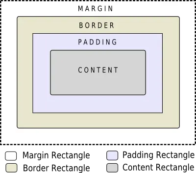
margin、border-width 和 padding 的默认值是 0 ,所以这四个矩形看起来是大小一致的。属性中的 background 是指 border 里边的背景,也就是 padding 矩形区域。盒子的渲染步骤为:
- 设置整个渲染操作的剪辑区域(如 border-radius 边角半径属性);
- 绘制背景(如 background-image 属性);
- 绘制边框(如 border-image, border 属性);
- 绘制叠加图像(如 image 属性);
子控件( Sub-controls )
一些复杂的部件还包含一些子控件,比如 QComboBox(下拉列表框部件)。它含有一个下拉按钮子控件,下拉按钮控件又含有一个下拉箭头子控件。用 QComboBox::drop-down 做下拉按钮的选择器,用 QComboBox::down-arrow 做下拉箭头的选择器。子控件是以双冒号开头的。

伪状态( Pseudo-States )
选择器与伪状态结合起来可以限定部件在某一状态下的样式,伪状态以单个冒号开头。比较常用的比如 :hover ,表示鼠标在部件上时候的状态。伪状态支持非运算符, !:hover 则表示鼠标不在部件上的时候。既然有非逻辑,那么有没有与和或逻辑呢?
这些可以有,当多个伪状态连着写就表示他们之间是与的关系,下例为对 QRadioButton::indicator 选择器各状态的样式定义:
QRadioButton::indicator {
  width: 13px;
  height: 13px;
}

QRadioButton::indicator:unchecked {
  image: url(:/images/radiobutton_unchecked.png);
}

QRadioButton::indicator:unchecked:hover {
  image: url(:/images/radiobutton_unchecked_hover.png);
}

QRadioButton::indicator:unchecked:pressed {
  image: url(:/images/radiobutton_unchecked_pressed.png);
}

QRadioButton::indicator:checked {
  image: url(:/images/radiobutton_checked.png);
}

QRadioButton::indicator:checked:hover {
  image: url(:/images/radiobutton_checked_hover.png);
}

QRadioButton::indicator:checked:pressed {
  image: url(:/images/radiobutton_checked_pressed.png);
}
当多个选择器间用逗号分割时,他们之间是或逻辑。如下实例中有对 QPushButton::menu-indicator 按下或者打开状态下样式的定义:
QPushButton:open { /* when the button has its menu open */
  background-color: qlineargradient(x1: 0, y1: 0, x2: 0, y2: 1,
                                    stop: 0 #dadbde, stop: 1 #f6f7fa);
}

QPushButton::menu-indicator {
  image: url(menu_indicator.png);
  subcontrol-origin: padding;
  subcontrol-position: bottom right;
}

QPushButton::menu-indicator:pressed, QPushButton::menu-indicator:open {
  position: relative;
  top: 2px; left: 2px; /* shift the arrow by 2 px */
}
动态属性( Dynamic Properties )
动态属性的格式是在选择器后加上带中括号的属性限定表达式,比如通过以下操作将三个输入框的背景色改为黄色:
*[mandatoryField="true"] { background-color: yellow }

QLineEdit *nameEdit = new QLineEdit(this);
nameEdit->setProperty("mandatoryField", true);

QLineEdit *emailEdit = new QLineEdit(this);
emailEdit->setProperty("mandatoryField", true);

QSpinBox *ageSpinBox = new QSpinBox(this);
ageSpinBox->setProperty("mandatoryField", true);
改变 QPushButton 的默认样式
对 QSS 有个大致的了解后,不妨来做一个实验,修改 QPushButton 的默认样式。一般情况下按钮有三个状态:普通状态、鼠标悬停上方时的状态、鼠标按下后的状态。如果要做出较为复杂的显示效果,一般会以 PNG 图片的形式展现。可以做出三幅图片,也可以将三个状态并列地做在一幅图片上,这里我们选择后者。
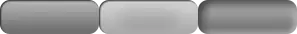
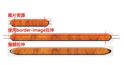
图中每个状态的尺寸为 99px * 34px ,正副图的尺寸为 297px * 34px 。虽然在三个状态下使用同一幅图片,但我们要显示不同的图片区间。在样式表里我使用了 border-image ,而没有使用 background ,原因是目前的 background 还不支持对图片的绝对位置的切割。
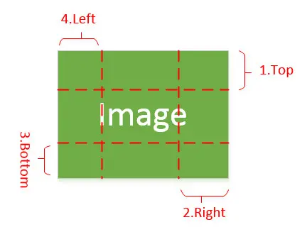
border-image 是从 CSS3 开始引入的一个非常好用的属性,在 QSS 中同样支持。它的原理是将图片以九宫格的形式分割并绘制在边框矩形中,四个角的四格图片保持不变,可以设置其余格子中图片拉伸、压缩、平铺等,从而保持在变换过程中图片整体更加自然。
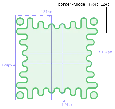
border-image 的语法为:
border-image: none | <image> [ <number> | <percentage>]{1,4} [ / <border-width>{1,4} ]? [ stretch | repeat | round ]{0,2}
在我们这次的命题里不用边缘部分的 8 个格,只用中间格的切割部分( border: 0px ),各状态切割如下图:
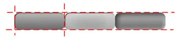
普通状态切割参数为 0 198 0 0
鼠标悬停上方时的状态切割参数为 0 99 0 99
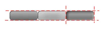
鼠标按下后的状态切割参数为 0 0 0 198
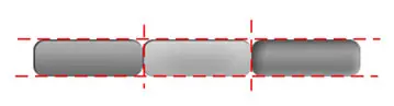
这次先不使用 .qss 样式表文件,直接在 QtCreator 的部件属性 StyleSheet 里设置:
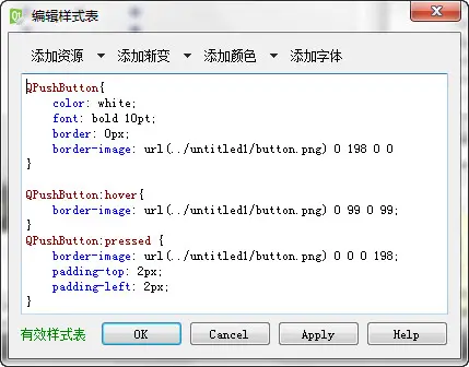
QPushButton{
  color: white;
  font: bold 10pt;
  border: 0px;
  border-image: url(../untitled1/button.png) 0 198 0 0;
}

QPushButton:hover{
  border-image: url(../untitled1/button.png) 0 99 0 99;
}

QPushButton:pressed {
  border-image: url(../untitled1/button.png) 0 0 0 198;
  padding-top: 2px;
  padding-left: 2px;
}
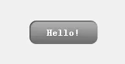
运行效果:
参考资料
- Qt Style Sheets http://doc.qt.io/qt-5/stylesheet.html
- Qt Style Sheets Reference http://doc.qt.io/qt-5/stylesheet-reference.html
- Qt Style Sheets Examples http://doc.qt.io/qt-5/stylesheet-examples.html
- Border Images http://www.w3.org/TR/css3-background/#border-images
版权声明:本文为 阡陌 的原创文章,遵循「CC BY-NC-SA 4.0」版权协议。若转载,请附上本文链接及本声明。
本文地址:https://www.mculoop.com/archives/45.html
若对本文有疑问可在评论区留言,我们看到后会尽量解答。